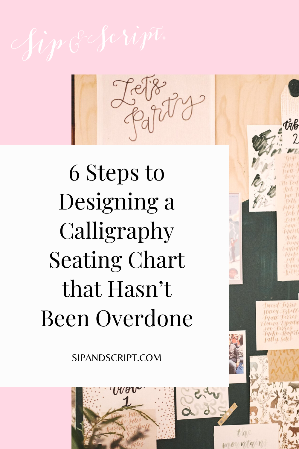
19 Jan 6 Steps to Designing a Calligraphy Seating Chart that Hasn’t Been Overdone
Have you ever noticed how sometimes calligraphy signage for weddings start to all look the same? As calligraphers it can be tough when a client comes to you with an idea that they want for their dream wedding and it’s something similar to signs you’ve seen flooding your IG feeds that whole season.
If you are engaged and looking to Pinterest for your calligraphy signage inspo I’m going to challenge you to stop and look to your venue, event details, and your significant other for ideas instead! What is the setting? Chic city affair or boho dessert getaway? Black tie or barefoot on the beach? What do you love to do as a couple and where do you love to go? All important elements to make your day-of details down to your stationery truly and 100% you!
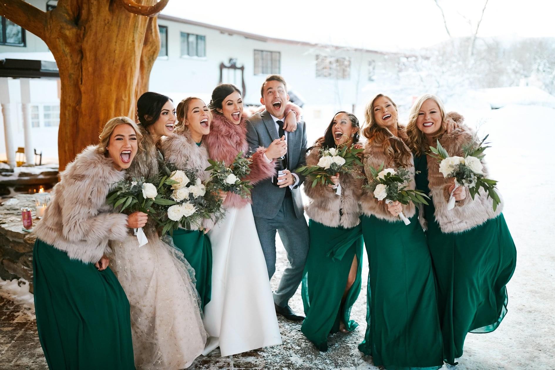
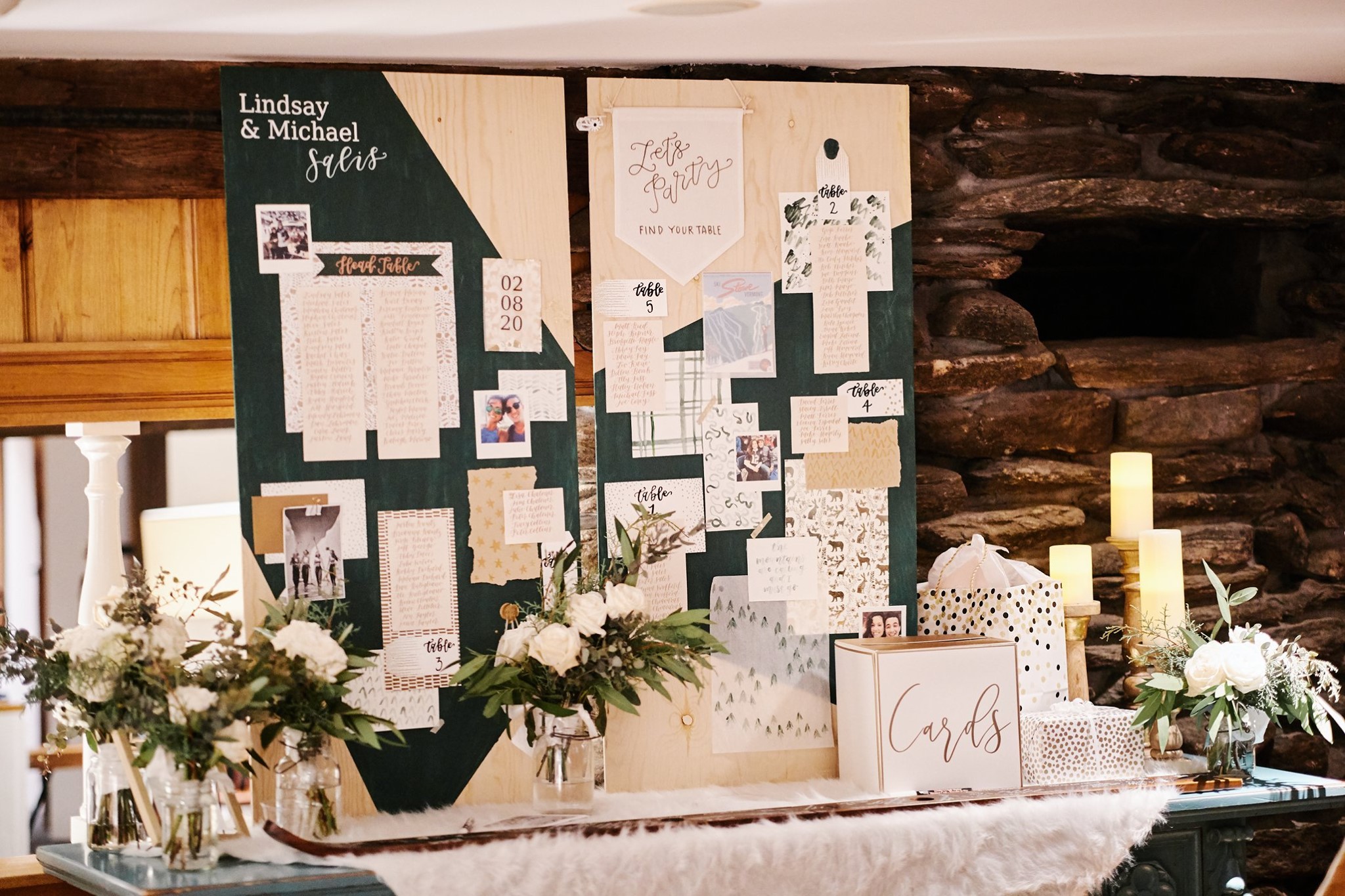
Although it’s been quite some time since I’ve actively taken on custom calligraphy work, I came out of wedding retirement last year for my sister’s winter wedding in Stowe, Vermont. She gave me free reign on any kind of signage I wanted to create so for months I knew I wanted to do something different that was uniquely theirs, especially in the form of a statement seating chart display.
Here I’m breaking down 6 steps for creating calligraphy signage that hasn’t been overdone:
- Look to your favorite places for inspiration instead of the top Pins
Instead of jumping right to Pinterest wedding boards to see what the latest and greatest trends were, I looked to her venue to inspire me. For everything in life, not just wedding work or calligraphy, I love getting inspiration for design in places and categories unrelated to the calligraphy world. That could be a completely different industry, a book, a mood, or in this case, a hotel.
- Pinpoint the elements that speak to you at your venue
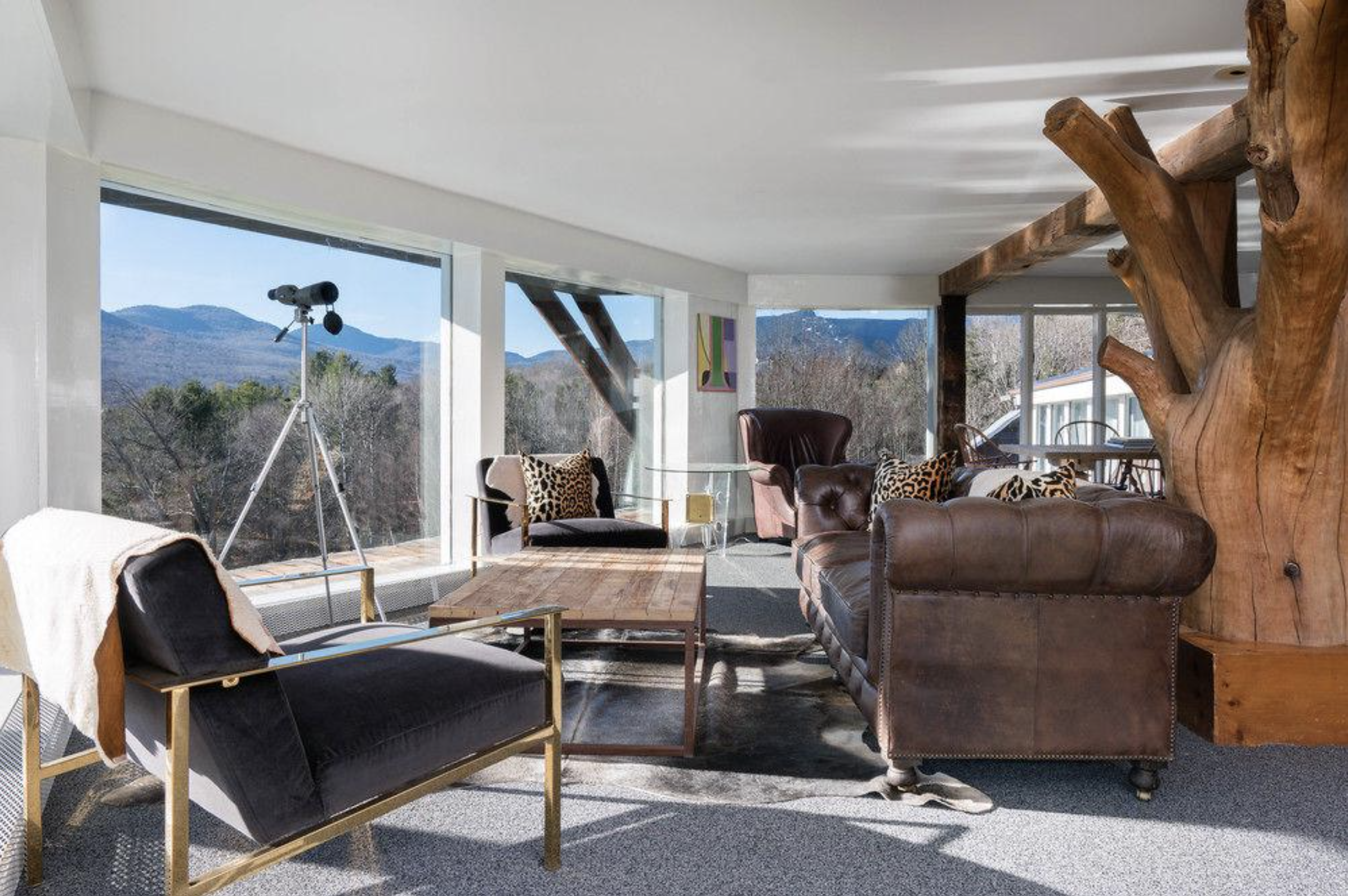
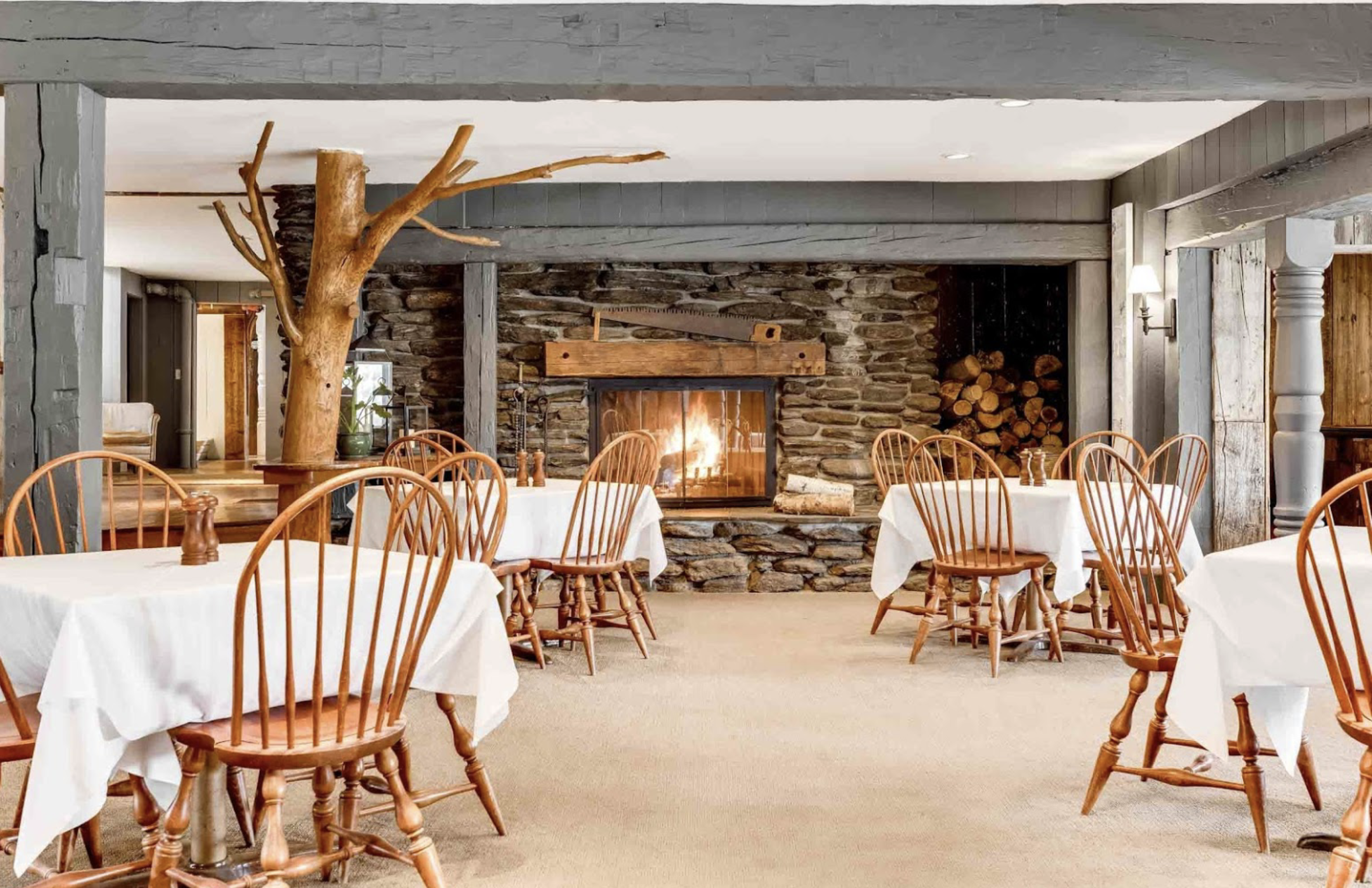
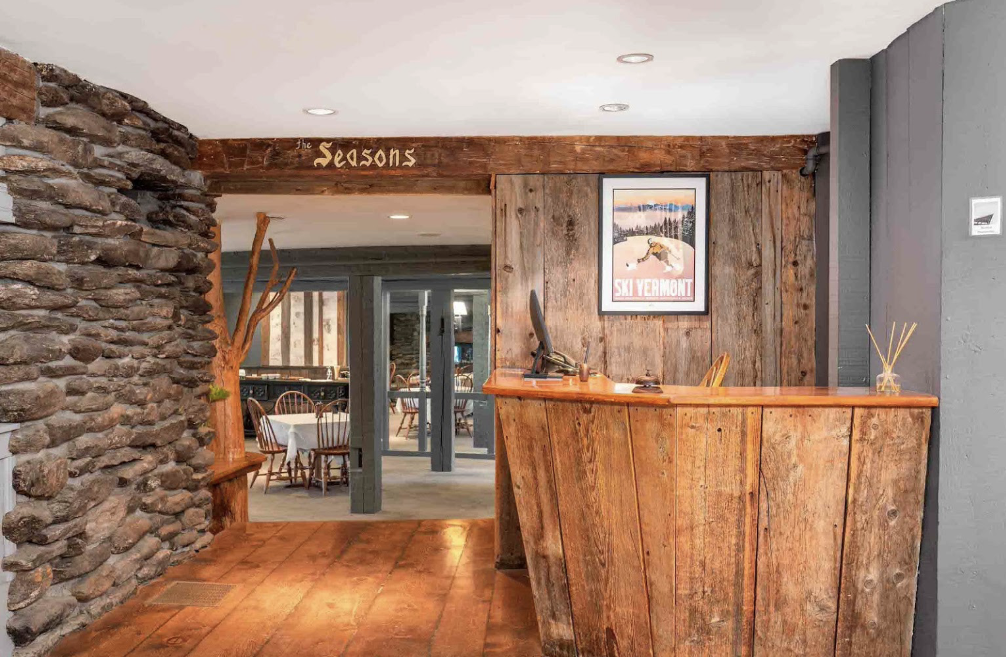
My sister’s wedding took place at The Stowehof Inn, which is a cozy and old school Swiss ski chalet type vibe built in the 1950s. People who love The Stowehof love the original quirky charm and it’s rustic, casual vibes set back with gorgeous views of Mt. Mansfield and Stowe’s surrounding woods. When thinking about her wedding signage I knew I wanted to compliment the eclectic mix of modern furnishings with it’s original fireplaces, framed vintage letters from guests as art and beautiful ski town backdrop.
- Think about your wedding weekend as whole
You can see that there are a lot of wood elements already in the space, and I didn’t want the seating chart to blend in with a wood sign. A large ornate mirror I felt would be too glam for a casual wedding weekend (she wanted a cozy ski weekend feel – we all wore flannel and slippers to the welcome party in the basement bar after a day on the slopes!) and didn’t want a clear acrylic sign to feel TOO modern in the space. Not to knock mirror signs or acrylic signs – they are gorgeous and if you LOVE them then totally use them!! My sister and her now husband love the mountains, love to ski and of course love family weekends in Stowe. These were important details I wanted to come through in the design.
- Incorporate what you already love
This could be a gallery wall of frames you admire or signage you use in your home but in this case, the design came to me from day to day work. I have always loved making collages which is why I went with a mood board theme. As a child I would cut out things from magazines and mod podge them to anything I could: my notebooks, treehouse, posters for my room. This translated well to my current job at Sip & Script as a content creator and social media/branding because mood boards are EVERYTHING. I believe I was actually on a pinning spree for 2020 when I had the idea to make a mood board style seating chart for the wedding!
- If you’re tired of seeing the same signs over and over again but don’t have a clear vision for them, talk to your calligrapher!
Share some details about your wedding and you as a couple and give your calligrapher creative freedom! They’d much rather help talk you through some ideas than have to imitate someone else’s work from photos you send them.
- If you want to go the mood board route too (no two will look the same!)
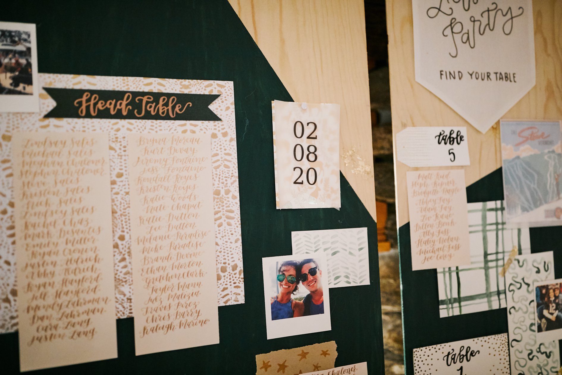
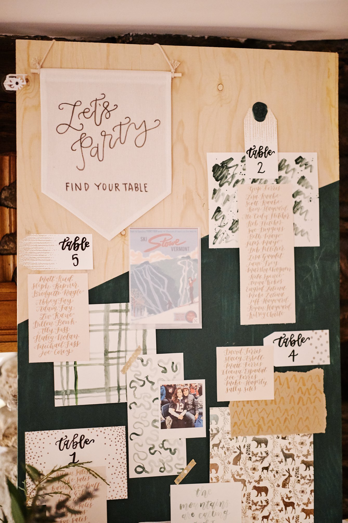
Just start collecting pieces from all over! Various papers, materials, textures and sizes. For this seating chart I purchased 2 pieces of birch plywood from Home Depot (precut and sized 2’x4’) to display side by side. I taped off a random pattern to paint some sections in her primary wedding color and left the plywood pieces raw. The fun thing about mood boards is that they don’t have to be perfect! Look around your venue area too. One of the planning trips up to Stowe we popped into a shop in town and found vintage ski postcards I ended up using in the mix.
I took pictures from my sister’s instagram and printed them out like polaroids (again not perfectly posed shots, although using engagement photos here would be fun too!) and then slowly over the month leading into finishing this I would collect scrapbook paper from Michaels, stationery pieces I had in my office like gift cards and envelopes, used tracing paper from our classes to watercolor the tree patterns. I ripped edges of paper to paint as well and used mod podge to adhere gold leaf flakes onto the raw wood. It was fun to collect all of these things and they lay them out to see what I needed more or less of! Other accessories that added an extra touch for layering were wax seals (here I used a snowflake stamp!) , washi tape, a flag banner I found at Hobby Lobby and feathers from her Bachelorette trip.
My sister ended up loving all the pieces and everyone throughout the weekend commented on how fun they were to look at, instead of just to find their names! Hope this encourages you think outside the box and do something less trendy more you for your wedding and/or your clients!
What kind of calligraphy signage do you hope to see this year?



No Comments